


An infrastructure diagram is a visual map of your system’s components, connections, and deployment boundaries — used by architects, engineers, SREs, and security teams to communicate how a system is built and how it behaves. If you’re starting from scratch, pick the audience and level of detail you need (context, container, component, or deployment), then sketch five to six core components and their connections before touching any tool.
According to a 2025/2026 industry study, Many workers say visual aids are crucial for effective teamwork. That number holds up in practice: a well-drawn diagram cuts incident triage time, speeds architecture reviews, and gives compliance auditors something concrete to evaluate.
The key things to know before you start:
- Choose your view first: context for executives, deployment for SREs, component for developers
- Use official icon sets (AWS Architecture Icons, for example) to avoid ambiguity
- Treat the diagram as a communication artifact, not an exhaustive inventory
- Version it in Git alongside your IaC code
Key Takeaways
Clear, audience-specific infrastructure diagrams reduce incident response time, support compliance audits, and keep architecture decisions grounded in how systems actually run.
| Point | Details |
|---|---|
| Visual aids drive alignment | Many workers say visual aids are crucial for effective teamwork, making diagrams worth the investment. |
| Match view to audience | Use the C4 hierarchy: context for stakeholders, container for architects, deployment for SREs and security teams. |
| Label every arrow | Annotate protocol, direction, and data type on every connection; unlabeled arrows are the most common diagram failure. |
| Version alongside IaC | Store Mermaid or draw.io XML source in Git with your Terraform modules to prevent diagram drift. |
| IT-Magic for complex engagements | IT-Magic delivers reviewed diagrams, IaC alignment, and compliance-ready documentation as part of every AWS architecture engagement. |
Table of Contents
Running this on your own AWS setup? IT-Magic is an AWS Advanced Tier Partner — we audit, fix, or fully manage it for you.
Get a free consultation- What are infrastructure diagrams and why do they matter?
- What types of infrastructure diagrams should you know?
- How do diagram levels and views help you pick the right detail?
- How to create an infrastructure diagram step by step
- Which tools and templates work best for infrastructure diagrams?
- How do diagram-as-code and IaC automation keep diagrams accurate?
- What are the best practices and common mistakes in diagramming?
- What do good infrastructure diagram examples look like?
- When should you DIY vs. hire an architect or consultant?
- IT-Magic delivers architecture diagrams as part of every engagement
- Sources
- FAQ
What are infrastructure diagrams and why do they matter?
A diagram is not an inventory and not a runbook. An inventory lists resources; a runbook describes procedures. An infrastructure diagram shows relationships: which services talk to which, over what protocol, across which trust boundary, and where data flows. AWS defines architecture diagramming as the practice of representing software and infrastructure components, their interactions, and their deployments in a visual format.
That distinction matters because different audiences read diagrams for different reasons.
| Audience | What they need from a diagram |
|---|---|
| Business stakeholders | Context view: what the system does and who uses it |
| System architects | Container and component views: service boundaries and dependencies |
| Network engineers | Deployment view: subnets, VPCs, routing, and firewall rules |
| SREs / DevOps | Deployment view: runtime placement, trust zones, failure domains |
| Security teams | Trust boundaries, data classification, and access paths |
| Compliance auditors | Data flows, encryption points, and regulatory scope boundaries |
The practical benefits go beyond alignment. A clear deployment diagram cuts the time it takes to identify a blast radius during an incident. A container-level diagram makes capacity planning concrete: you can see where a single service is a bottleneck before load testing confirms it. For PCI DSS, SOC2, or HIPAA audits, a diagram with labeled data flows and trust boundaries is often the first artifact an auditor requests.

Pro Tip: Keep one diagram per audience. A single “master” diagram that tries to serve architects, SREs, and executives simultaneously ends up serving none of them — it’s either too abstract or too cluttered to be useful.
What types of infrastructure diagrams should you know?
AWS categorizes architecture diagrams into several common types, each suited to a different review question:
- Cloud architecture diagrams show cloud services, managed resources, and their relationships. Use these for design reviews, cost analysis, and onboarding new engineers to a cloud-native system.
- Network/infrastructure diagrams map physical or logical network topology: routers, switches, firewalls, load balancers, and subnets. The right choice for network engineers planning capacity or troubleshooting connectivity.
- Deployment diagrams show where software runs: which containers land on which hosts, inside which VPC, behind which security group. SREs and platform engineers live in these.
- Integration diagrams trace data flows between systems, APIs, and third-party services. Useful for identifying single points of failure and for mapping data residency for compliance.
- DevOps/CI-CD pipeline diagrams visualize build, test, and deploy stages. Use them to document automation workflows and surface bottlenecks in delivery pipelines.
- Data architecture diagrams show storage systems, data flows, transformation stages, and retention policies. Compliance teams and data engineers both rely on these.
- System/context diagrams sit at the highest level of abstraction: one box for your system, surrounded by the external actors and systems it interacts with. The right starting point for any new diagram.
Each type maps to a view level. Context diagrams are always high-level. Deployment diagrams are always low-level. Network infrastructure maps and data center schematics typically sit at the deployment or component level, depending on how much runtime detail they include.
How do diagram levels and views help you pick the right detail?
The C4 model, developed by Simon Brown, gives a clean four-level hierarchy that most engineering teams can adopt without ceremony:
- Context — one box for your system, external users, and external systems. Answers: “What does this system do and who uses it?” Business stakeholders and product owners read this level.
- Container — the deployable units inside your system: web apps, APIs, databases, message queues. Answers: “What are the major building blocks and how do they communicate?” Architects and senior engineers read this level.
- Component — the internal structure of a single container: modules, classes, interfaces. Answers: “How is this service organized internally?” Developers working on that service read this level.
- Deployment — the infrastructure that runs the containers: servers, VMs, containers, cloud regions, availability zones, network boundaries. Answers: “Where does this actually run and what are the trust boundaries?” SREs, network engineers, and security teams read this level.
Simon Brown’s guidance on drawing architectural diagrams is explicit: produce multiple views matched to specific audiences rather than one diagram that tries to cover everything. A context diagram shown to an SRE during an incident is noise. A deployment diagram shown to a business stakeholder during a roadmap review is equally useless.
Every view, regardless of level, should include:
- A title with the view type, system name, and date
- A legend explaining every shape, color, and line style
- Named components with stable IDs (not just “Service A”)
- Labeled arrows showing protocol, direction, and payload type
- Trust boundaries drawn as explicit regions or borders
- Author name and review status
Pro Tip: When you’re unsure which level to draw, ask: “What decision does this diagram need to support?” The answer tells you the audience, and the audience tells you the level.
How to create an infrastructure diagram step by step
The most common mistake is opening a tool before defining the purpose. Start with a sentence: “This diagram shows [view level] of [system name] for [audience] to support [decision or review].” That sentence is your scope boundary.
- Define purpose and audience. Write the one-sentence scope. Name the specific people who will read it and the decision they need to make.
- Sketch the context view first. Draw your system as a single box. Add external users and external systems. Label every arrow with what crosses the boundary (user requests, API calls, data feeds).
- Expand to containers. Break the system box into its deployable units. Keep it to the components that matter for the review question. Resist adding every microservice.
- Annotate protocols and data flows. Label every arrow: protocol (HTTPS, gRPC, AMQP), direction (request/response or event), and payload type (JSON, binary, PII flag if relevant).
- Add trust boundaries. Draw explicit regions around VPCs, security groups, compliance scope boundaries (PCI cardholder data environment, for example), and external networks.
- Add legend and metadata. Every shape and color needs a legend entry. Add title, author, date, audience, and review status to the diagram canvas.
- Run a review checklist. Before sharing: are all arrows labeled? Are trust boundaries named? Does the legend cover every symbol? Is there a stable ID on every component?
- Version it. Commit the source file (Mermaid, draw.io XML, or SVG) to the same Git repository as your IaC code. Tag it with the infrastructure version it reflects.
Pro Tip: Start with five to six core components and iterate. A diagram with 30 boxes on the first draft is almost always wrong for its audience. Add detail only when a reviewer asks a question the current diagram can’t answer.
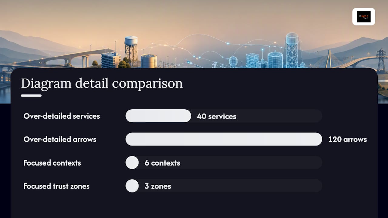
A before/after example makes this concrete. An over-detailed diagram of a microservices platform might show 40 services, 120 arrows, and no trust boundaries. The same system drawn as a container view for an architecture review shows six bounded contexts, labeled inter-service protocols, and three trust zones. The second version takes 20 minutes to review; the first takes 90 minutes and still leaves questions unanswered.
Which tools and templates work best for infrastructure diagrams?
The right tool depends on three factors: whether your team needs real-time collaboration, whether you want diagrams generated from code, and whether you need official cloud icon sets.
Diagrams.net (draw.io) is the most flexible free option. It ships with shape libraries for AWS, Azure, GCP, Cisco, and network equipment, stores files as XML (editable in Git), and exports to SVG and PNG. It runs in a browser or as a desktop app, and it integrates with Confluence and Google Drive. The learning curve is low; the output is professional.
Lucidchart offers the strongest real-time collaboration of any visual editor. It supports AWS icon libraries, has a template gallery for cloud and network diagrams, and integrates with Jira, Confluence, and Google Workspace. Pricing is subscription-based; the free tier is limited to three documents.
Gliffy is purpose-built for Confluence users. Its cloud architecture diagram templates and shape libraries make it a fast starting point for teams already in the Atlassian ecosystem. Less flexible than draw.io for standalone use.
PlantUML and Mermaid are diagram-as-code tools: you write text, they render diagrams. Mermaid integrates natively into GitHub, GitLab, and Notion, making it the right choice when you want diagrams to live in Markdown documentation. PlantUML has broader diagram type support (sequence, component, deployment) and a larger community library.
Structurizr is built specifically around the C4 model. You define your architecture in a DSL, and Structurizr renders context, container, component, and deployment views automatically. It enforces the C4 hierarchy, which is a feature if your team uses C4 and a constraint if they don’t.
AWS Infrastructure Composer (part of the AWS Console) generates visual diagrams from CloudFormation templates and lets you edit the diagram to update the template. Cloudcraft specializes in AWS and Azure cloud infrastructure visuals with isometric 3D rendering, live AWS account sync, and cost estimation overlays.
| Tool | Best for | Collaboration | Diagram-as-code / IaC | AWS icons | Pricing | Export formats |
|---|---|---|---|---|---|---|
| diagrams.net (draw.io) | Flexible visual editing | Async (XML in Git) | Limited (manual) | Yes | Free / open source | SVG, PNG, XML |
| Lucidchart | Real-time team collaboration | Real-time | Limited | Yes | Subscription (free tier) | SVG, PNG, PDF, Visio |
| Gliffy | Confluence-embedded diagrams | Confluence-based | No | Yes | Subscription | PNG, SVG, JIRA |
| PlantUML | Text-driven, version-controlled | Git-based | Yes (DSL) | Via community libs | Free / open source | SVG, PNG, PDF |
| Mermaid | Docs-embedded, GitHub/GitLab | Git-based | Yes (Markdown) | Limited | Free / open source | SVG, PNG |
| Structurizr | C4 model enforcement | Web-based | Yes (C4 DSL) | Via C4 libs | Free tier + paid | SVG, PNG, PlantUML |
| AWS Infra Composer | CloudFormation-linked diagrams | AWS Console | Yes (CFN) | Native | Free (AWS account) | CloudFormation YAML |
| Cloudcraft | AWS/Azure cloud visuals + cost | Web-based | AWS live sync | Native | Free tier + paid | SVG, PNG, PDF |
For file formats to keep: store Mermaid source for text-driven diagrams, draw.io XML for editable visuals, and plan JSON exports for IaC-based diagrams. SVG is the right export format for documentation because it scales without loss and supports text alternatives for accessibility.
How do diagram-as-code and IaC automation keep diagrams accurate?
The core problem with hand-drawn diagrams is drift. An engineer adds a new service, updates the Terraform module, and forgets to update the diagram. Three months later, the diagram is wrong, and nobody knows it until an incident.
Diagram-as-code solves half the problem. Tools like Mermaid and PlantUML keep diagram source in the same repository as code, so diagrams go through pull request review alongside infrastructure changes. The diagram-as-code CLI for AWS takes this further: it generates AWS architecture diagrams from configuration templates and can be integrated into a CI pipeline to regenerate diagrams on every PR.
IaC-to-diagram generators go one step further by parsing your actual infrastructure definitions. InfraSketch generates architecture diagrams from Terraform, CloudFormation, and Kubernetes manifests, and exports to SVG, Mermaid, and draw.io format. The key trade-off it documents: using plan JSON (the resolved output of terraform plan) is more accurate than parsing raw HCL, because plan JSON resolves count, for_each, and variable substitutions that raw HCL leaves ambiguous.
Practical patterns for automation:
- PR-triggered regeneration: add a CI step that runs your diagram generator on every PR touching IaC files and commits the updated SVG or Mermaid source back to the branch
- Docs embedding: render Mermaid diagrams directly in GitHub README files or Confluence pages so documentation always reflects the current diagram source
- Drift detection: diff the generated diagram against the committed version in CI; fail the build if they diverge
The honest trade-off: auto-generated diagrams from IaC are accurate about what exists but often poor at communicating why it’s structured that way. Trust boundaries, data classification labels, and compliance scope annotations rarely survive automated generation. Use IaC-generated diagrams as a baseline, then layer in the context that matters for human readers.
Pro Tip: Commit diagram source files (Mermaid, draw.io XML) to Git alongside your Terraform modules. A diagram that lives in Confluence but not in version control is already drifting.
What are the best practices and common mistakes in diagramming?
The primary goal of a diagram is communication. Engineers too often treat diagrams as exhaustive maps of every service rather than selective abstractions built around a specific review question. That instinct produces diagrams that are technically complete and practically useless.
Do:
- Name components concretely (“checkout-api” not “API Service”)
- Show trust boundaries explicitly as labeled regions (VPC, PCI scope, DMZ)
- Label every arrow with protocol, direction, and data type
- Attach metadata: title, author, date, audience, review status, and a stable component ID
- Version diagram source files in Git alongside IaC
- Include a text alternative or description for every diagram (an
altattribute on SVG embeds, or a short prose description in the doc) so screen readers and automated checks can validate the view
Don’t:
- Use generic labels (“Database,” “Service,” “Queue”) that force readers to guess
- Show every microservice in a context or container diagram — group them into bounded contexts
- Let diagrams drift from the deployed state; a wrong diagram is worse than no diagram
- Assume one diagram serves all audiences
For architecture review meetings, run this checklist before presenting:
- Does the title state the view level, system, and date?
- Is every arrow labeled with protocol and direction?
- Are trust boundaries named and drawn as explicit regions?
- Does the legend cover every shape and color?
- Are component IDs stable and consistent with IaC resource names?
- Has the diagram been reviewed by at least one person who wasn’t the author?
Pro Tip: Use color-coded grouping for trust boundaries and team ownership. A deployment diagram where each team’s services share a background color makes incident escalation paths obvious at a glance.
What do good infrastructure diagram examples look like?
Three views cover most engineering needs:
- Context view for a web application: one box for the web app, external users on the left, third-party services (payment processor, identity provider, analytics) on the right, labeled arrows showing what crosses each boundary. Fits on a single slide. Useful for onboarding and stakeholder reviews.
- Container view for a microservices platform: bounded contexts as boxes (auth, orders, inventory, notifications), message queues and API gateways as explicit components, labeled inter-service protocols. Trust boundaries drawn around the internal network and the external-facing API layer.
- Deployment view showing trust zones: VPC boundaries, public and private subnets, security group labels, availability zone placement, and external network connections. PCI or HIPAA scope drawn as a named compliance boundary.
For downloadable templates, these sources maintain actively updated libraries:
- diagrams.net shape libraries include AWS, Azure, GCP, and network equipment shapes in draw.io XML format
- Gliffy’s cloud architecture template library provides ready-to-edit starting points for common cloud patterns
- AWS Architecture Icons are the official icon set for AWS service diagrams; use them in client deliverables and slide decks (check the AWS usage guidelines before redistributing)
- The C4 model site provides starter templates for all four views in PlantUML and Structurizr DSL
For compliance-focused diagrams (PCI DSS, SOC2, HIPAA), start from a deployment view template and add: a named compliance scope boundary, data classification labels on arrows carrying regulated data, and a legend entry for each regulatory boundary type. Security reviewers need to see encryption points, access control boundaries, and data residency at a glance.
Public infrastructure visualization projects like Open Infrastructure Map illustrate how large-scale infrastructure maps handle layering and overlays — useful reference for anyone designing data center schematics or telecom network maps with multiple overlay types.
| Template type | Best format | Primary use case |
|---|---|---|
| Context view | Mermaid or SVG | Stakeholder reviews, onboarding |
| Container view | draw.io XML or SVG | Architecture reviews, design docs |
| Deployment view | draw.io XML or SVG | SRE runbooks, compliance audits |
When should you DIY vs. hire an architect or consultant?
Most teams can produce context and container diagrams in-house with the tools and workflow described above. The question of when to bring in external help is really a question about risk surface and complexity.
DIY works when your system fits in a single AWS account, your team has done this architecture before, and the diagram is for internal documentation rather than a compliance audit or a board-level design review.
Hire or engage a consultant when:
- Your architecture spans multiple AWS accounts or regions with complex cross-account IAM and network peering
- You’re entering PCI DSS, SOC2, or HIPAA scope and need diagrams that satisfy an auditor’s evidence requirements
- You’re planning a major migration (on-prem to cloud, monolith to microservices) and the diagram needs to drive the migration plan, not just document the current state
- Your team’s bandwidth is consumed by operations and there’s no one to own the diagram review cycle
- Cost optimization is on the table and you need architecture diagrams that map spending to components accurately enough to make decisions
The signals that justify external engagement are cumulative. One complex account is manageable. One complex account plus an upcoming SOC2 audit plus a planned EKS migration is a situation where an experienced AWS architect pays for themselves in avoided rework.
IT-Magic delivers architecture diagrams as part of every engagement
Diagrams.net, Lucidchart, and IaC generators are all solid tools. But a diagram is only as good as the architectural judgment behind it. Getting the trust boundaries right, labeling compliance scope accurately, and keeping diagrams in sync with a live AWS environment requires someone who has done it across dozens of production systems.

IT-Magic is an AWS Advanced Tier Services Partner that has delivered 700+ projects since 2010. Every architecture engagement includes reviewed infrastructure diagrams, IaC alignment checks, and documentation templates your team can maintain going forward. For teams entering PCI DSS, SOC2, or HIPAA scope, diagrams are part of the compliance evidence package, not an afterthought. For teams planning migrations or cost optimization, the architecture diagram is the starting point for every decision.
If you’re at the stage where the diagram needs to be right, not just good enough, talk to the IT-Magic team about an architecture assessment and get a clear picture of what your engagement would deliver.
Sources
- Empower teams to work in new ways with visual collaboration
- What is Architecture Diagramming?
- C4 model
FAQ
What is an infrastructure diagram?
An infrastructure diagram is a visual representation of a system’s components, connections, and deployment boundaries. It shows how services communicate, where they run, and which trust boundaries separate them, giving engineers and stakeholders a shared reference for design, troubleshooting, and compliance reviews.
How do you create an infrastructure diagram?
Start by defining the audience and the decision the diagram needs to support, then sketch a context view with five to six core components before expanding to containers or deployment detail. Label every arrow with protocol and direction, draw explicit trust boundaries, add a legend and metadata, and commit the source file to Git alongside your IaC code.
Can ChatGPT create architecture diagrams?
ChatGPT can generate Mermaid or PlantUML diagram source code from a text description, which you can then render in diagrams.net, GitHub, or Structurizr. It works well as a starting point for simple diagrams, but it cannot read your live infrastructure state, so the output always needs review and correction against your actual deployment.
What are the main types of infrastructure diagrams?
The most common types are cloud architecture diagrams, network/infrastructure diagrams, deployment diagrams, integration diagrams, DevOps/CI-CD pipeline diagrams, and data architecture diagrams. Each type serves a different audience and review question, as AWS documents in its architecture diagramming guidance.
What is the C4 model and should you use it?
The C4 model is a four-level view hierarchy (context, container, component, deployment) that structures diagrams by audience. It’s worth adopting if your team produces diagrams for multiple audiences, because it gives everyone a shared vocabulary for which level of detail to expect from a given view.
Recommended
- Cloud Architecture Planning Guide for IT Leaders
- AWS Management Tools for Engineering Leaders: Choose by Category
- Advantages of Infrastructure Automation for Technical Leaders
- What Is Infrastructure Orchestration: A 2026 Guide
Alexander founded IT-Magic, an AWS Advanced Tier Services Partner delivering DevOps, cloud architecture, and managed services since 2010. He holds:
- AWS Certified Solutions Architect – Professional
- AWS Certified DevOps Engineer – Professional
- AWS Certified Security – Specialty
- AWS Certified Advanced Networking – Specialty
Talk to a certified AWS team trusted by INTERTOP, Foxtrot, Pandora, and J.Hilburn.
Get a free consultation